
The Importance of Clear Data Presentation
In a world overflowing with data, being able to analyze and present findings in a clear, professional manner is crucial. Data analysis reports are essential tools that help you communicate insights effectively, whether you are a business analyst, researcher, or student. However, with so many options available, it can be a challenge to find the Best Software to Write Up Data Analysis Reports that meets your specific needs.
The gap between raw data and a report that actually changes someone’s decision is bigger than most people expect. A spreadsheet full of numbers convinces no one on its own; it needs narrative structure, clear visuals, and a logical flow from finding to recommendation before a stakeholder will act on it. The tools below split roughly into two camps: general-purpose writing and presentation software that you populate with your own analysis, and dedicated analytics platforms that generate visualizations directly from connected data sources. Matching the tool to your actual workflow, rather than picking whatever is most popular, saves the most time.

Common Challenges in Choosing Data Analysis Software
Navigating the vast landscape of software tools can often lead to confusion. You might ask yourself: Which software offers the best data visualization options? Is there a tool that integrates seamlessly with my existing workflows? What features should I prioritize? The search for the Best Software to Write Up Data Analysis Reports can be overwhelming, especially when the right choice can significantly impact how well you communicate your data findings.
Reproducibility Matters More Than It Seems
A report that cannot be regenerated when new data arrives becomes stale the moment it is finished. If your analysis needs to run again next month with updated numbers, tools like R Markdown or Power BI that separate the analysis logic from the presentation layer save considerable time compared to manually rebuilding charts in a static document each cycle. Weigh how often the underlying report needs refreshing before picking a purely static writing tool.
Your Guide to Top Software Solutions for Data Reports
In this comprehensive guide, we will explore the Best Software to Write Up Data Analysis Reports. Our aim is to provide you with an informed choice, highlighting tools that not only make report writing easier but also enhance your ability to convey insights. Let’s dive in and discover the best options available to help you create impactful reports that stand out.
1. Microsoft Word
Overview
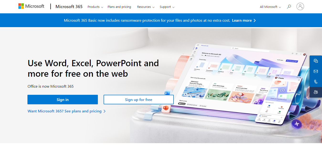
When it comes to traditional word processing, Microsoft Word is a heavyweight champion. It is widely recognized as one of the Best Software to Write Up Data Analysis Reports due to its comprehensive features and versatility.
Key Features
- Robust Editing Tools: Offers spell check, grammar suggestions, and formatting options that enhance document quality.
- Template Library: A range of report templates that can save you time.
- Collaboration: Allows multiple users to edit the same document in real-time.
Why It’s Great
Microsoft Word’s familiarity and powerful features make it an essential tool for crafting professional reports. It’s perfect for those who appreciate having full control over document layout and formatting. Because virtually every stakeholder already has it installed, a Word report also requires zero onboarding friction when you send it to executives, clients, or committee members who may not be comfortable opening a specialized analytics tool.
2. Google Docs
Overview
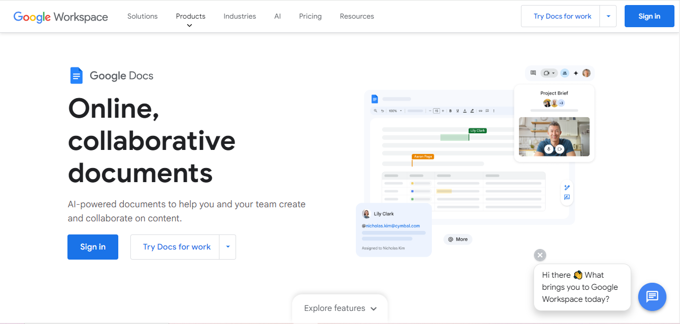
Google Docs is a cloud-based word processor that has transformed how we collaborate on documents. Its real-time editing and sharing capabilities make it one of the Best Software to Write Up Data Analysis Reports.
Key Features
- Seamless Sharing: Share documents easily via links and control editing permissions.
- Version History: Track changes and restore previous versions.
- Add-ons: Integrate various tools to enhance functionality.
Why It’s Great
Google Docs allows you to collaborate effortlessly, making it ideal for teams working on data analysis reports together. Plus, it’s accessible from any device with internet access. Its unlimited version history is particularly valuable for collaborative reports with multiple contributors, letting you roll back to any earlier draft if an edit introduces an error into a shared analysis.
3. Tableau
Overview
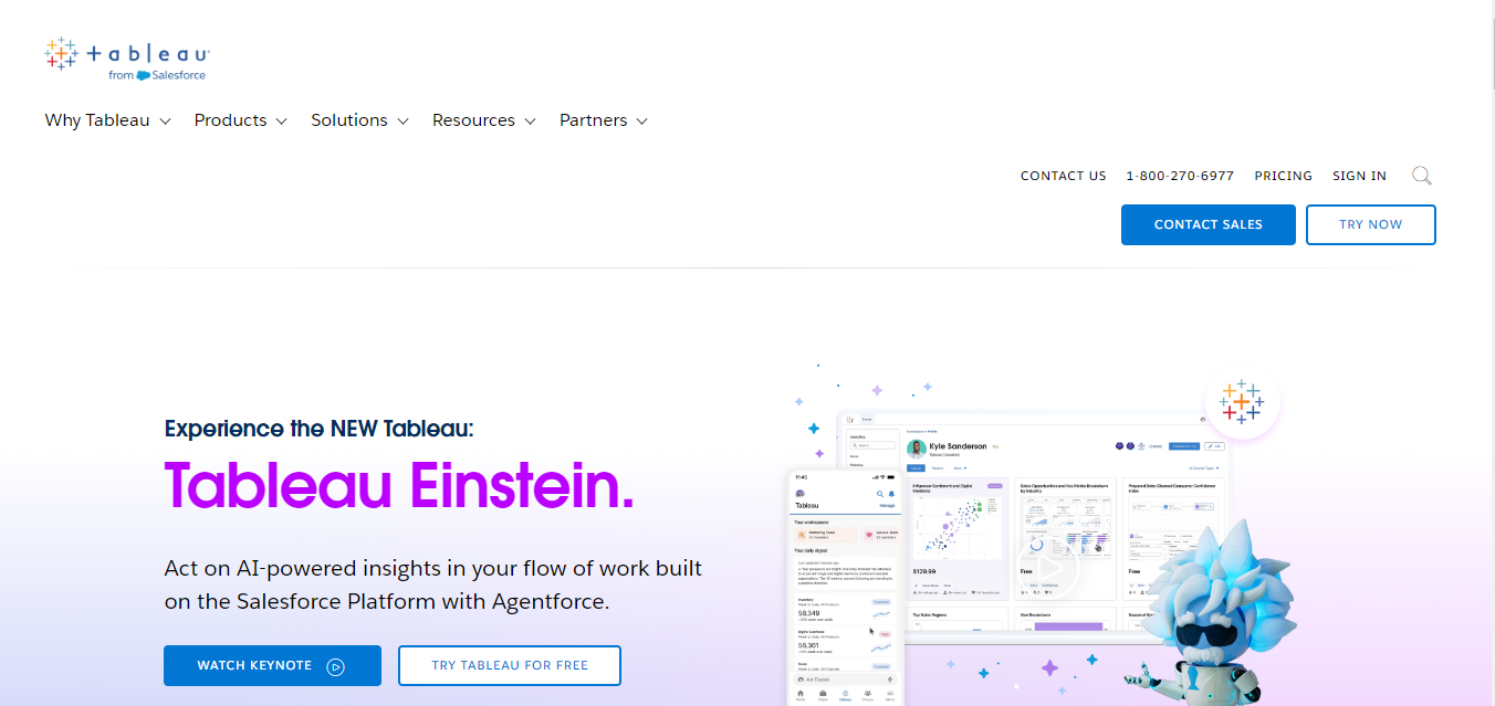
For data visualization and reporting, Tableau is a top contender. It enables users to transform raw data into compelling visual stories, making it a prime choice among the Best Software to Write Up Data Analysis Reports.
Key Features
- Interactive Dashboards: Create dashboards that engage users and facilitate data exploration.
- Data Connections: Connect to various data sources, including Excel, SQL, and cloud-based databases.
- Custom Visuals: Design personalized charts and graphics that enhance your report.
Why It’s Great
Tableau’s ability to create visually stunning reports helps you communicate your insights more effectively. Its intuitive interface and powerful visualization options make it a favorite among analysts. Unlike a static Word document, a Tableau dashboard updates automatically as its connected data source refreshes, which turns a one-time report into a living resource stakeholders can revisit rather than requesting a new version every month.
4. Microsoft Excel
Overview
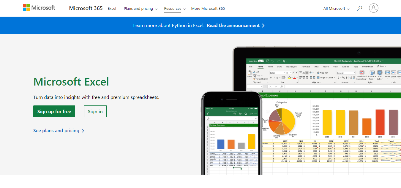
Microsoft Excel is more than just a spreadsheet tool; it is one of the Best Software to Write Up Data Analysis Reports because of its robust analytical features.
Key Features
- Data Analysis Tools: Functions like PivotTables and advanced formulas help summarize and analyze data.
- Charts and Graphs: Easily create a variety of visualizations to enhance your reports.
- Conditional Formatting: Highlight important data points automatically.
Why It’s Great
Excel is a workhorse for anyone dealing with data. Its analytical capabilities allow you to manipulate and present data effectively, making it a vital tool for report writing. PivotTables specifically remain one of the fastest ways to summarize a large dataset into a digestible cross-tabulation without writing a single formula, which is why it stays the default choice for quick internal reports even among analysts who use dedicated BI tools for polished client-facing work.
5. R Markdown
Overview
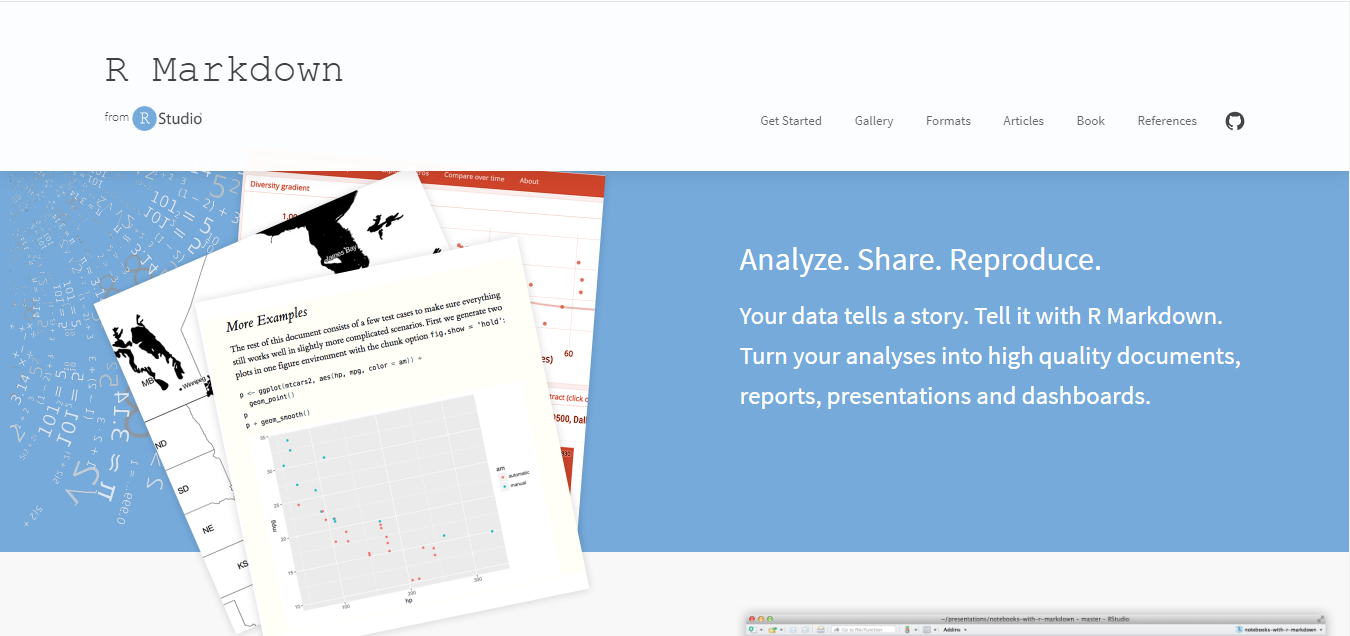
For those familiar with programming, R Markdown is an excellent choice for creating dynamic reports directly from R. It is particularly useful for statisticians and data scientists, marking its place as one of the Best Software to Write Up Data Analysis Reports.
Key Features
- Dynamic Document Creation: Combine R code with markdown text to produce reports.
- Reproducibility: Easily reproduce analyses and ensure consistency in your reports.
- Multiple Output Formats: Export reports in PDF, HTML, or Word formats.
Why It’s Great
R Markdown promotes reproducible research, allowing analysts to generate reports that not only present results but also document the analytical process. This is invaluable for transparency and validation. Because the code and narrative live in the same document, re-running the entire report against a refreshed dataset is a single command rather than manually redoing every calculation and chart by hand, which is a major time saver for recurring reports.
6. LaTeX
Overview
LaTeX is a document preparation system commonly used in academia and technical fields. It is renowned for producing high-quality documents, making it one of the Best Software to Write Up Data Analysis Reports for those who need precise formatting.
Key Features
- Complex Formatting: Ideal for documents that include mathematical formulas and technical content.
- Bibliography Management: Easy integration of citations and references.
- Cross-Referencing: Automatically updates references within the document.
Why It’s Great
LaTeX is especially beneficial for producing complex reports that require rigorous formatting and presentation, making it a favorite among researchers and scientists. Its automatic numbering of equations, figures, and citations eliminates a whole category of manual formatting errors that plague long technical reports written in a standard word processor, where a single inserted figure can throw off every subsequent reference number.
7. Airtable
Overview
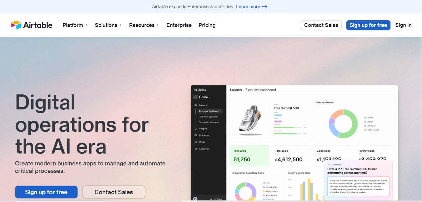
Airtable combines the functionality of a spreadsheet with the features of a database, positioning itself as one of the Best Software to Write Up Data Analysis Reports. Its visual layout helps in organizing data effectively.
Key Features
- Customizable Views: Switch between grid, calendar, and kanban views for better data management.
- Integration: Connect with various apps to streamline your workflow.
- Collaboration: Work together with team members in real-time.
Why It’s Great
Airtable’s visual organization makes data management intuitive, while its collaborative features facilitate teamwork, making it an excellent choice for report writing. Its ability to switch the same underlying data between a grid, a calendar, and a kanban board without duplicating anything is genuinely unusual, and it means one dataset can serve both the raw analysis and a more visual status-tracking view for stakeholders.
8. Notion
Overview
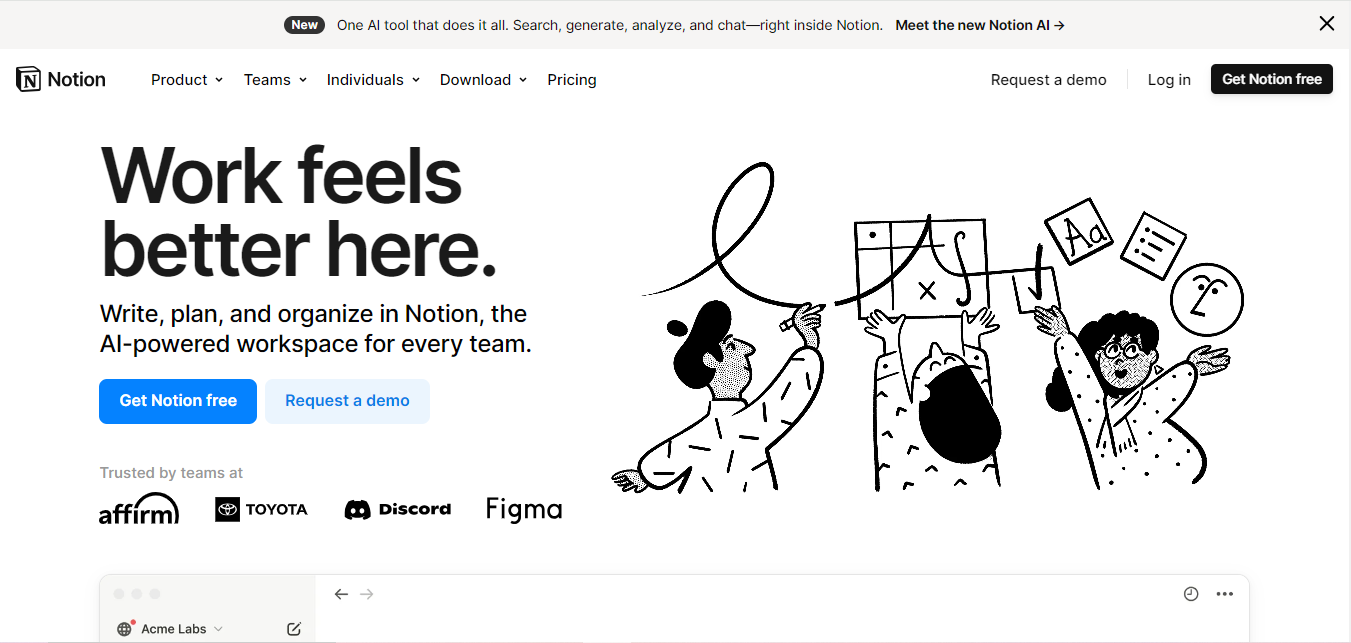
Notion is a versatile workspace that combines notes, tasks, databases, and calendars into a single platform. It is increasingly popular for report writing, being recognized as one of the best software to write up data analysis reports.
Key Features
- All-in-One Workspace: Organize your notes, documents, and tasks in one place.
- Customizable Templates: Create your own report structures to suit your needs.
- Integration Capabilities: Easily connect with other applications for added functionality.
Why It’s Great
Notion’s flexibility allows users to craft personalized reports that can include various types of content. Its clean design makes information easy to digest and navigate. Embedding a linked database view directly inside the report itself, rather than a static screenshot of a table, means readers always see current figures without you needing to manually update the document each time the numbers change.
9. Google Slides

Overview
Though primarily a presentation tool, Google Slides can also serve as one of the Best Software to Write Up Data Analysis Reports. It allows users to create engaging visual presentations of their data.
Key Features
- Presentation Templates: A range of slide layouts to help you present your findings effectively.
- Real-Time Collaboration: Work with team members on your presentation.
- Easy Import: Import data and visuals from Google Sheets seamlessly.
Why It’s Great
Google Slides makes it easy to create visually appealing presentations that can accompany written reports, allowing you to communicate your insights in an engaging format. Its linked charts feature means a chart pulled in from Google Sheets can update automatically when you refresh it, rather than needing to re-export and re-paste a static image every time the underlying numbers change before a meeting.
10. Power BI
Overview
Power BI is a business analytics tool by Microsoft that provides interactive visualizations and business intelligence capabilities. It is increasingly regarded as one of the Best Software to Write Up Data Analysis Reports.
Key Features
- Data Modeling: Create complex models to analyze data from various sources.
- Dashboards and Reports: Generate real-time dashboards that showcase critical metrics.
- Sharing and Collaboration: Share insights across your organization effortlessly.
Why It’s Great
Power BI’s robust data visualization capabilities allow users to create detailed reports that are easy to interpret. Its integration with other Microsoft products enhances its functionality, making it an excellent choice for professionals. Its scheduled refresh feature can pull updated numbers from a connected database every night automatically, so the dashboard stakeholders check each morning is always current without any manual intervention from the analyst who built it.
Comparison Table
| Name of Tool | Best for | Standout Feature | Pricing |
|---|---|---|---|
| Microsoft Word | Traditional word processing | Robust Editing Tools | Subscription or one-time purchase |
| Google Docs | Cloud-based collaboration | Seamless Sharing | Free with Google Account |
| Tableau | Data visualization and reporting | Interactive Dashboards | Subscription-based |
| Microsoft Excel | Data analysis and presentation | Data Analysis Tools | Subscription or one-time purchase |
| R Markdown | Dynamic report creation | Reproducibility | Free (R software required) |
| LaTeX | Complex document preparation | Complex Formatting | Free (various distributions available) |
| Airtable | Data organization and collaboration | Customizable Views | Free and premium plans available |
| Notion | All-in-one workspace | Customizable Templates | Free and premium plans available |
| Google Slides | Visual presentations | Presentation Templates | Free with Google Account |
| Power BI | Business analytics | Data Modeling | Subscription-based |
Frequently Asked Questions
Which tool is best for a one-time report versus a recurring monthly report?
For a one-time report, Word, Google Docs, or Google Slides get the job done quickly. For a recurring report, R Markdown or Power BI save significant time long-term since they automate the regeneration process rather than requiring a manual rebuild each month.
Do I need to know how to code to use R Markdown or produce reproducible reports?
R Markdown does require basic familiarity with R. If coding is not an option, Power BI and Tableau offer much of the same automatic-refresh benefit through a visual interface instead of written code.
What is the best free option on this list?
Google Docs, Google Slides, LaTeX, and R Markdown are all free to use. Airtable and Notion offer generous free tiers as well, sufficient for individual use or small teams.
How do I choose between a written report and a dashboard?
Written reports work better for a one-time deep analysis meant to be read start to finish, such as a research paper or annual review. Dashboards suit ongoing monitoring where stakeholders check specific metrics repeatedly rather than reading a full narrative each time.
Can I combine multiple tools in one workflow?
Yes, and it is common practice: many analysts do the heavy data work in Excel or R, build the visualization in Tableau or Power BI, and then write the final narrative summary in Word or Google Docs, exporting charts as images to embed in the finished document.

Choosing the Right Software
When it comes to crafting compelling data analysis reports, selecting the Best Software to Write Up Data Analysis Reports is crucial for effective communication. With options ranging from traditional word processors to specialized visualization tools, each software has unique features that cater to different needs.
Consider what aspects are most important for your reporting process, be it collaboration, data visualization, or complex formatting. By investing time in choosing the right software, you can enhance the clarity and impact of your reports, ensuring that your data insights are communicated effectively.