Monthly Active Users is the metric that launched a thousand pitch decks and killed a thousand communities that were actually working. When you look at community metrics in 2026, MAU is where most teams start and where most dashboards stop. That’s the problem.
If you run a community, you’ve probably watched MAU climb on a dashboard while something felt off. Members join, poke around, and go quiet. The number says growth. The Slack channel or forum thread says something else entirely. You post a question and get two responses. You host an event and 8 people show up.
MAU measures presence, not participation. It counts logins, not conversations. It captures the fact that someone opened an app, not that they got value from being there.
Community managers who optimize for MAU end up sending re-engagement emails, running “welcome back” campaigns, and treating churn as a content problem when it’s usually a value problem. They’re chasing a number that tells them how many people touched the door, not how many sat down at the table.
This post is about the six metrics that actually predict whether your community is healthy in 2026, how to calculate them, what benchmarks exist across platforms like Circle, Skool, Discourse, and BuddyPress, and how to build a dashboard that gives you an honest weekly read on where things stand.
Why MAU Misleads Community Builders
MAU was built for social media products with ad-based revenue models. The more people return to the platform, the more ads get served. Monthly activity as a proxy for value made sense in that context.
Community is a different product category entirely. A community creates value through relationships, answers, accountability, and social proof. None of those things require monthly logins. They require people to show up, contribute, and receive something back.
The failure mode is real and common. Teams spend months optimizing onboarding flows to push MAU up, add notification channels, gamify logins with streaks, and run content calendars specifically to generate re-engagement. The MAU number climbs. Renewals don’t improve. NPS stays flat. Member-generated content volumes drop even as active user counts rise.
The underlying problem: they were measuring traffic, not engagement. Those are different things in any product category, but in community the gap is especially wide because community value is almost entirely created by members, not by the platform team.
Replace MAU with the six metrics below and you get a picture that actually explains what’s happening and what to fix.
The 6 Community Metrics 2026 Teams Should Track
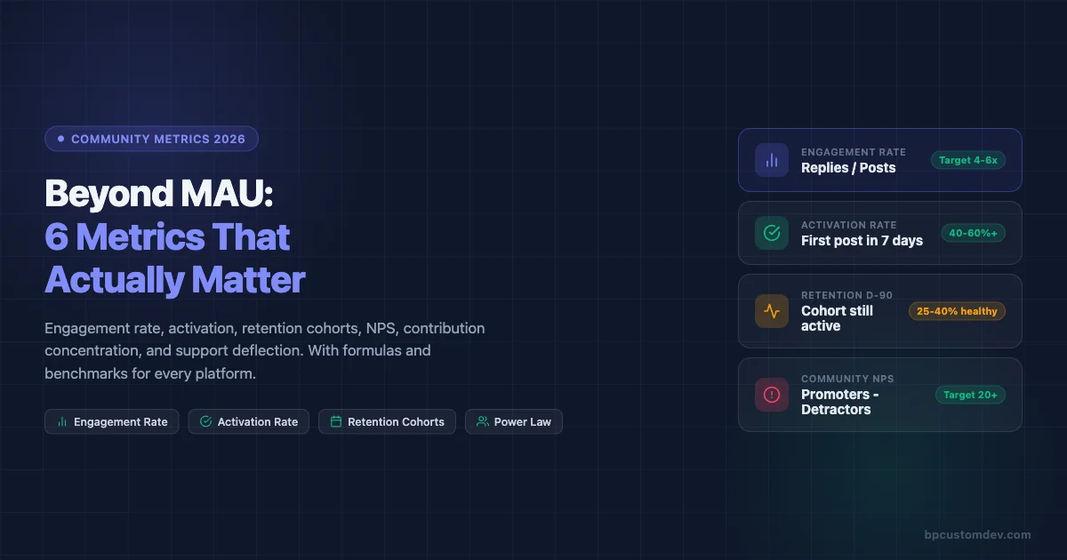
1. Engagement Rate (Post-to-Reply Ratio)
Engagement rate measures how much of your community’s content generates real conversation versus broadcasting into silence.
Formula: Engagement Rate = (Total Replies in Period) / (Total Posts in Period)
A post with zero replies is a broadcast. A community full of zero-reply posts is a newsletter with comments disabled. Engagement rate cuts through surface-level activity counts and shows you whether people are actually talking to each other.
How to calculate it: Count every original post or question in your community over a 30-day window. Count every reply or comment on those posts. Divide replies by posts. Do not count upvotes or reactions as replies.
Benchmarks by platform:
- Circle: Healthy communities typically run 3.5-6 replies per post. Below 2 signals a lurker-heavy member base or poor content quality. Above 8 often means a small core of very active members carrying the load.
- Skool: Gamification mechanics drive slightly higher ratios. Target 4-7. Watch for artificial inflation from celebration posts that rack up quick replies but don’t reflect substantive conversation.
- Discourse: Forum-style communities often run lower on simple ratios because threads can be long with few starters. Better to track replies-per-topic at the category level. Healthy technical communities: 5-12 per topic. Q&A categories: 3-8.
- BuddyPress: Activity stream communities vary widely. Track at the group level. Groups with fewer than 2 replies per post need intervention or archiving.
What to do when it’s low: Don’t add more content. Add better content. Seed questions with built-in controversy or genuine uncertainty. Ask members to share an opinion, not just information. Reduce the volume of announcements that expect no reply.
2. Activation Rate (New Member First Post Within 7 Days)
Activation is the single best leading indicator of long-term retention. If a new member makes their first post or reply within seven days of joining, they are dramatically more likely to still be active at the 90-day mark.
Formula: Activation Rate = (Members Who Posted Within 7 Days of Join Date) / (New Members in Period) x 100
The seven-day window is not arbitrary. Most community platforms show the same pattern: members who reach first contribution in week one retain at 60-80% through month three. Members who don’t post in week one retain at 15-25% through month three. The gap is that wide.
How to measure it: Pull your member join dates and your post/reply author data. Match them. Count how many people who joined in a given month had at least one authored post or reply in the first seven days. Divide by total new joiners.
Benchmarks:
- Below 20%: Your onboarding is not giving people a reason or path to contribute. Typical for communities where onboarding is purely informational.
- 20-40%: Average. Most communities with a welcome thread or intro prompt land here.
- 40-60%: Good. Usually the result of structured first-week journeys, welcome DMs with a specific question, or onboarding calls.
- Above 60%: Excellent. Typically requires a combination of personal outreach, a compelling first-post hook, and a community culture where new members feel safe posting.
Platform-specific implementation:
- Circle: Use the automation feature to send a personal DM to new members with a specific question. Track the response rate separately from overall activation.
- Skool: The intro post prompt in the Classroom section drives activation well. Pin a thread specifically for newcomers where the social pressure of “nobody else replied yet” is absent.
- Discourse: The built-in “Getting Started” wizard can be customized to require a post as a final step. Many communities also gate access to higher trust levels behind first-post completion.
- BuddyPress: Use bp_core_new_user actions to trigger automated welcome group invitations. Groups with a designated “Introduce Yourself” topic consistently outperform those without one.
3. Retention Cohorts (30/60/90 Day)
Retention cohorts show you what percentage of members who joined in a given month are still active 30, 60, and 90 days later. This is the closest thing community has to a product-market fit signal.
Formula: Cohort Retention Rate = (Members from Cohort Active at Day N) / (Total Members in Cohort) x 100
Active here must be defined. Use a definition that requires contribution, not just login. A member is active if they posted, replied, or attended a live event in the measurement window.
How to build the table: Group members by join month. For each cohort, check their activity at 30, 60, and 90 days post-join. Track the percentage active at each checkpoint. Plot as a table by month to spot trends.
What healthy retention curves look like:
- Day 30: 50-70% still active is strong for community. Below 30% is a warning sign.
- Day 60: Expect a drop. 35-50% active is healthy. Below 20% means the community is not delivering on its promise.
- Day 90: The core is forming here. 25-40% is solid. Below 15% means you’re running a revolving door.
The shape of the curve matters as much as the absolute numbers. A curve that drops steeply from day 1 to day 30 and then flattens signals that the people who stay are deeply committed. A curve that continues falling equally through 90 days signals a product or value problem, not just an onboarding problem.
Cohort comparisons unlock the real insight: If members who joined after you launched a new onboarding sequence show 15% higher 60-day retention than the prior cohort, that’s a clean signal that the change worked. MAU will never show you that.
4. Net Promoter Score Inside the Community
Community NPS is underused. Most SaaS companies run NPS on their product and ignore the community experience entirely, even when community is a core part of the product or support model. The global NPS benchmark by Satmetrix shows that subscription software categories average around 31, giving community teams a practical baseline to measure against.
Formula: Community NPS = % Promoters (9-10) – % Detractors (0-6)
The standard NPS question works well here: “On a scale of 0-10, how likely are you to recommend [Community Name] to a colleague or peer?”
Follow it with two open fields: “What’s the most valuable thing you’ve gotten from this community?” and “What’s one thing that would make this community more useful?”
When to run it: Survey at the 30-day mark for new members. Run a full-community survey every six months. If you’re launching a new initiative, run a targeted pulse survey 30 days later.
Benchmarks:
- Below 0: Your community has more detractors than promoters. Serious retention and reputation risk.
- 0-20: Acceptable but room for improvement. Most communities that don’t invest in member experience land here.
- 20-40: Good. Members value the community but it hasn’t become a habit or identity for most.
- Above 40: Strong. Members are actively recommending the community and see it as a meaningful part of their professional life.
The qualitative data is where the value is: The open-ended responses tell you what your community actually does for people, in their words. Use that language in your onboarding copy, your sales page, and your event descriptions.
5. Top 10% Member Power Law (Contribution Concentration)
Every community follows a power law in contribution. A small percentage of members generate a disproportionate share of the content, answers, and energy. Knowing who they are and how concentrated that contribution is tells you two critical things: how fragile your community is, and who your community actually depends on.
Formula: Contribution Concentration = (Posts + Replies by Top 10% of Contributors) / (Total Posts + Replies) x 100
What the numbers mean:
- If your top 10% generate more than 80% of total content: You have a brittle community. If three or four people burn out or leave, activity will collapse.
- If your top 10% generate 50-70% of content: Healthier but still dependent. You need a second tier of regular contributors.
- If your top 10% generate 30-50% of content: Strong distribution. You have a genuine community culture rather than a personal brand support group with a forum attached.
What to do with this data:
- Identify your top contributors. Make sure they know they’re valued. Give them access, recognition, or early previews that reflect their status.
- Identify your “almost top” tier, members in the 10-25% range. These are candidates for growth into the core. One-on-one conversations often convert them from occasional participants to regulars.
- Track this metric quarterly. A trend toward higher concentration is a leading indicator of burnout and community stall.
Platform notes:
- Circle: Member profiles show post counts. Export or use the API to pull contribution data.
- Skool: The leaderboard surfaces top contributors but measures points, not raw contribution. Distinguish between points from posting and points from classroom progress.
- Discourse: The built-in admin dashboard shows top poster and top reply lists with full counts. This is the easiest platform for running this analysis.
- BuddyPress: Query the wp_bp_activity table grouped by user_id to get contribution counts per member.
6. Support Deflection Rate (Customer Communities Only)
If you run a customer community, this metric has direct revenue implications. Support deflection rate measures how often community members find answers from peers or existing discussions rather than opening a support ticket.
Formula: Deflection Rate = (Support Tickets Avoided via Community) / (Total Support Interactions) x 100
Measuring “avoided” tickets requires a proxy. The most reliable approach: track the volume of search-and-read sessions in your community knowledge base or forum that end without a ticket being opened. Alternatively, run a post-search survey asking “Did you find what you needed?” and use yes-rate as your deflection proxy.
Benchmarks for customer communities:
- Below 20%: Your community is not functioning as a support channel. Members don’t trust peer answers or can’t find relevant content.
- 20-40%: Community is supplementing but not replacing significant support volume.
- 40-60%: Community is meaningfully reducing ticket load. This is where customer success teams start seeing the ROI clearly.
- Above 60%: Excellent. You’ve built a self-service knowledge layer that compounds.
The revenue math: If your average support ticket costs $15 to resolve and your community deflects 500 tickets per month, that’s $7,500 in direct cost avoidance. At 60% deflection on 1,000 monthly inquiries, the number becomes $9,000/month or $108,000/year. This calculation justifies community investment in language that finance teams understand.
How to Measure These Metrics on Each Platform
Circle
Circle’s analytics dashboard gives you member activity counts, space-level engagement, and trend lines for post and reply volume. For advanced analysis, use the Circle API. The /members endpoint returns join dates and last-active dates. The /posts endpoint returns post counts with author IDs, enabling you to build the contribution concentration analysis externally.
For activation rate: export new member data weekly, cross-reference against post/reply data by user ID, and flag those who posted within 7 days. A simple Google Sheet formula handles this at small scale. At scale, pipe the data into a reporting tool like Databox or build a Zapier workflow that tags activated members automatically. If you’re still deciding whether Circle is the right platform for your use case, see our Circle vs Skool 2026 comparison for a full breakdown.
Skool
Skool’s built-in analytics surface engagement rates at the community level and leaderboard rankings by points. The limitation is that Skool does not currently offer an official API, so deeper analysis requires manual exports or third-party integrations via the Skool Zapier connection.
For cohort retention: export your member list monthly with join dates. Track point activity as a proxy for contribution. Members with zero point change over 30 days are inactive for retention purposes.
Support deflection is harder to measure on Skool since it does not have a native helpdesk integration. Track it by counting posts in your “Questions” or “Support” space that receive a peer answer before you respond as a team member.
Discourse
Discourse has the most complete analytics of any community platform. The admin dashboard includes engagement reports, user trust level progression, top topic and poster reports, and category-level activity summaries. The Data Explorer plugin lets you run custom SQL against your community database.
Useful Data Explorer queries for this analysis:
- Posts and replies per user in a date range (contribution concentration)
- New users who posted within 7 days of account creation (activation rate)
- Monthly cohort retention at 30/60/90 days using first-post dates and last-activity dates
Discourse also integrates with Zendesk and other helpdesk tools via API, making support deflection trackable through search-then-open patterns.
BuddyPress
BuddyPress stores all activity data in the wp_bp_activity table. The key fields are user_id, component, type, and date_recorded. You can query this table directly to build every metric covered in this post. For a broader look at how BuddyPress stacks up against other platforms on features and analytics depth, the BuddyPress vs Circle vs Mighty Networks vs Skool comparison covers the practical differences.
Sample queries:
- Engagement rate: Count activity items of type
activity_updateas posts andactivity_commentas replies. Divide comment count by update count for a given date range. - Activation rate: Join
wp_users(user_registered) withwp_bp_activity(date_recorded, user_id). Count users whose first activity item falls within 7 days of their registration date. - Contribution concentration: Group
wp_bp_activityby user_id, count items, rank users, and calculate what percentage of total items the top 10% generate.
For NPS, use any survey tool and segment responses by member join cohort for the most actionable cut of the data.
Measurement Cadence
Not every metric needs to be reviewed at the same frequency. Over-measuring creates noise and dashboard fatigue. Under-measuring means you catch problems late.
| Metric | Review Frequency | Trigger for Action |
|---|---|---|
| Engagement Rate | Weekly | Drop below platform benchmark for 2 consecutive weeks |
| Activation Rate | Weekly (new members) | Falls below 30% for two consecutive cohort weeks |
| Retention Cohorts | Monthly | 30-day retention drops more than 10 points vs prior month |
| Community NPS | Bi-annual + event-triggered | Score drops below 20 or detractor % rises more than 5 points |
| Contribution Concentration | Monthly | Top 10% generating more than 80% of content |
| Support Deflection | Monthly | Rate drops below 30% for customer communities |
Dashboard Template: What to Track and Where
A practical community dashboard has three sections: a health summary, a new member pipeline, and a content quality view. Here’s how to structure it.
Health Summary (Updated Weekly)
- Engagement Rate (current week vs 4-week average)
- New Members This Week
- Activation Rate This Week (% of last week’s new members who posted)
- Most Active Members (top 5 by post/reply count)
New Member Pipeline (Updated Weekly)
- Members joined in past 7 days
- Members who posted in their first 7 days (count + %)
- Members who have not posted yet (names for manual outreach)
- 7-day activation rate trend line (last 12 weeks)
Content Quality View (Updated Monthly)
- Top 10 posts by reply count
- Posts with 0 replies (signals content that needs help or removal)
- Category or space breakdown: which areas of your community are active vs dormant
- Contribution concentration: top 10% share of total posts + replies
Retention Cohort Table (Updated Monthly)
A rolling 6-month cohort table showing 30/60/90-day retention for each joining cohort. Simple color coding: red below benchmark, green above. This single table will tell you more about your community’s trajectory than any other visualization.
Connecting the Metrics to Real Decisions
Metrics only matter if they change what you do. Here’s how each of the six metrics maps to specific community management decisions.
Low engagement rate means you should audit your content mix, not add more content. Are too many posts announcements instead of questions? Are you posting more than your members are? Shift the ratio.
Low activation rate means your onboarding isn’t giving new members a clear, low-friction path to their first contribution. Add a specific ask in your welcome message. Make the first post feel low-stakes. Follow up personally with people who haven’t posted after day 3.
Declining retention cohorts mean the community isn’t delivering on its implied promise. Interview members who went quiet in month two. What did they come expecting? What did they find? The answer is your product roadmap.
Low community NPS means something is creating a negative experience for a segment of your members. Detractors are rarely silent about the reason. Read the open-ended responses. The patterns will be obvious.
High contribution concentration means you need to deliberately grow your second tier. Reach out to people who are active but not posting. Ask for their opinion on a specific topic. Give them a reason to move from reader to contributor.
Low support deflection in a customer community means your knowledge base isn’t findable or isn’t complete. Audit the most common support tickets. If the answer exists in the community, fix the search. If the answer doesn’t exist, create it.
Building Toward 2026: What’s Changing
Three shifts are affecting how forward-looking community teams think about measurement in 2026.
AI-generated content is inflating surface metrics. Platforms that allow AI-assisted posting are seeing post volumes rise while reply rates drop. If your engagement rate metric is trending down while post count is trending up, check whether AI tools are being used to fill the content calendar. Posts that members recognize as AI-generated receive fewer responses.
Platform migration is creating measurement gaps. Communities moving from one platform to another lose their historical data unless they plan for it. If you’re migrating from Slack to Circle, or from a Facebook Group to Discourse, document your pre-migration benchmarks before you move. Our guide on moving from Slack to a real community platform covers how to structure that transition without losing your measurement baseline. Otherwise you have no baseline to measure against.
Community is increasingly multi-channel. The same community often has a main platform, a Discord server, a WhatsApp group, and a newsletter. Measuring engagement across all of them requires agreeing on where “the community” lives for measurement purposes. Pick one primary platform and treat it as your measurement home base. Track others qualitatively rather than trying to create a combined metric.
Getting Started: The Minimum Viable Community Dashboard
If you’re starting from scratch on community measurement, don’t try to implement all six metrics in week one. Build up incrementally.
Week 1-2: Set up tracking for activation rate and engagement rate. These are the two highest-leverage metrics and they’re achievable with basic data that every platform exposes.
Month 1: Build your first cohort retention table. It will be one row, but the structure will be in place for the pattern to emerge over the next three months.
Month 2: Run your first community NPS survey. Use the 30-day survey for new members as your starting point.
Month 3: Pull contribution concentration data. You now have enough data to make decisions about who to cultivate and where your community is fragile.
Month 6: If you run a customer community, set up support deflection tracking. By this point you’ll have a baseline on the other metrics, and you can use deflection rate to make the business case for community investment in financial terms that resonate with executives.
MAU isn’t going away as a metric entirely. It still has a place in board reporting as a top-line engagement signal that investors and executives understand. But it should not be driving your day-to-day community management decisions. The six metrics above will.
The communities that will outperform in 2026 are the ones run by people who understand that you build for depth, not breadth. High engagement rate over a smaller, activated, retained membership beats a large but passive audience every time. The data makes this case clearly. Your job is to measure the right things so the data tells the right story.