How to Enhance Activity Updates with Interactive Backgrounds, Colors and Images ?
BuddyPress Quotes lets members post activity updates on colored or image backgrounds instead of a plain white card. Here's how to curate a palette that looks intentional rather than chaotic, and why an admin-controlled library beats open uploads.
The BuddyPress Quotes plugin lets members post activity updates against a colored or image background instead of the plain white card every status update defaults to. It’s the same visual pattern Facebook popularized years ago with colored-background status posts, a small formatting change that measurably changes how much attention a post gets in a feed full of otherwise identical white cards.

Why visual variety matters more than it seems
Scroll through a busy BuddyPress activity feed and most updates blend together, same white card, same layout, same typography, differentiated only by whatever text or photo the member happened to attach. That sameness is efficient for the platform but forgettable for anyone actually reading it. A short, punchy thought, a milestone, a quote, an announcement worth a second glance, gets exactly the same visual treatment as a mundane status update, and mundane wins by sheer volume.
Colored and image backgrounds break that pattern. A member scrolling past a wall of white cards stops on the one that looks different, the same reflex that makes a highlighted line in a document catch your eye before the surrounding paragraph does.
This isn’t a novel insight, every major consumer social platform has independently arrived at some version of the same mechanic, from Facebook’s colored status backgrounds to Instagram Stories’ text-on-background format to Twitter’s occasional experiments with quote cards. When several unrelated platforms converge on the same design pattern, it’s usually because the underlying behavioral effect is real, not because they copied each other’s homework. A BuddyPress community adopting the same idea at a smaller scale is borrowing a proven mechanic, not chasing a fad.
Key features of BuddyPress Quotes
1. Interactive background selection. Members choose from a set of backgrounds, solid colors or images, when composing an activity update, rather than being stuck with a plain card.
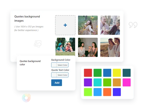
2. Admin-curated palette and image library. The site administrator uploads the images and defines the solid colors available in that selection menu, which keeps the visual style consistent with your site’s branding instead of members picking clashing, off-brand colors.
3. Automatic text-color inversion. Pick a dark background and the plugin flips the text to a readable light color automatically, and vice versa, a small detail that prevents the embarrassing failure mode of unreadable white-on-white or black-on-black text, which is the kind of bug that would otherwise generate a support ticket the first week the feature goes live.
4. Manual override for automatic color selection. If the automatic contrast choice isn’t quite right for a specific image, members or admins can override it.
5. Removable defaults. Site admins can delete any pre-loaded color or image from the selection pool if it stops fitting the site’s visual identity.
6. Works in both activity streams and groups. Quotes can be published as regular site-wide activity updates or inside a specific group’s activity feed.
7. Dedicated icon in the composer. A quotes icon sits in the “What’s New” posting box alongside other formatting options, so members discover the feature without needing a tutorial.
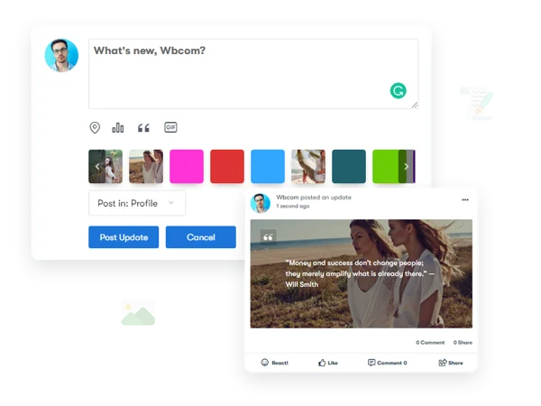
8. A curated selection, not an open upload. Members choose from what the admin has provided rather than uploading their own arbitrary backgrounds, this is a deliberate constraint, not a missing feature, and it’s worth understanding why below.
Setting up a palette that actually looks intentional
The single most important decision here is curating a small, cohesive set of colors and images rather than uploading dozens of options. A palette of six to ten colors pulled from your site’s actual brand palette, plus a handful of relevant images, produces a feed where quote-style posts look like a deliberate design feature. A palette of forty randomly chosen stock colors produces a feed that looks like a browser’s default color picker got loose in your activity stream.
Pull your color values directly from your theme’s existing palette rather than guessing at hex codes that seem close. If your site runs a custom theme with defined brand colors, use those exact values here, consistency between the quotes feature and the rest of your site’s visual identity is what makes it read as native rather than bolted on.
Why members don’t get to upload their own backgrounds
This is a common first question, and the constraint is intentional rather than a limitation to work around. An open upload system means every member effectively becomes a designer, and the resulting feed ends up visually incoherent, clashing colors, mismatched image styles, low-resolution photos stretched awkwardly behind text. Curating the palette at the admin level keeps every quote post, regardless of which member created it, looking like it belongs on your site rather than looking like a random image someone found on their phone.
It also sidesteps a moderation problem before it starts. An open image-upload feature attached to a public-facing activity post is an obvious vector for someone to upload something inappropriate as a “background.” A curated, admin-controlled library has no such exposure.
There’s a third, less obvious benefit to the closed-palette approach: it makes the whole activity feed, over time, feel like a designed product rather than a collection of individually customized posts. Visit any platform that allows fully open, unrestricted user customization at scale and you’ll notice the aesthetic drifts toward chaos, every possible combination of clashing choices eventually gets used by somebody. Constraining the palette is what keeps a community’s feed looking coherent even as hundreds of different members contribute to it.
What actually gets posted as a quote versus a regular update
The feature works best for content that’s genuinely quote-shaped, short, self-contained, meant to stand alone rather than lead into a longer conversation. A milestone announcement, an inspiring line, a short community shoutout, an event date. It works less well for anything that needs more than a sentence or two of context, since cramming a long paragraph onto a colored background either shrinks the text uncomfortably or overflows the card awkwardly depending on how the template handles length.
Encourage this distinction explicitly if you’re rolling the feature out to an existing community, a short guideline note (“quotes work best for short, punchy updates”) in your community guidelines saves members from discovering the length limitation the hard way after posting something that renders poorly.
A useful mental model for members: if it fits comfortably on a physical greeting card or a printed inspirational poster, it fits the quote format. If it needs a paragraph to explain itself, it belongs in a regular status update instead. That comparison, dropped into an onboarding tip or a help article, communicates the format’s intended use faster than a technical explanation of character limits ever would.
Using this for community identity, not just decoration
Beyond individual member posts, admins can use branded quote backgrounds for official community announcements, a recurring “Member of the Month” format, a consistent visual template for weekly discussion prompts, a branded look for milestone celebrations. Reusing the same background and style for a recurring content type builds recognition over time; members start to recognize “oh, this is the Friday discussion prompt” from the visual pattern alone, before even reading the text.
This kind of repetition works the way any recurring visual branding works, a newspaper’s masthead, a podcast’s intro jingle, a recurring segment format on a YouTube channel. The content changes week to week; the wrapper stays constant, and that constancy is what turns a one-off post into a recognizable, anticipated feature of the community.
Three community types and how they’d use this differently
A motivational or personal-development community. This is close to the ideal use case, members sharing short wins, affirmations, and milestones are exactly the kind of content that benefits from a visually distinct treatment. A colored-background post announcing “hit my 30-day streak today” reads as a celebration in a way the same text on a plain white card doesn’t quite manage. Curate a palette here that leans toward energetic, warm colors rather than muted corporate tones.
A professional or B2B community. Restraint matters more here. A palette of two or three subdued, brand-aligned colors, used sparingly for genuine announcements, a company milestone, a product launch, a recognition post, keeps the feature feeling appropriate to the tone of the community rather than importing a casual, consumer-social-media aesthetic into a professional space where it might read as out of place.
An event-driven or seasonal community. Swap the image library periodically to match seasonal themes or upcoming events, holiday-appropriate backgrounds in December, event-branded images during a conference week. This keeps the feature feeling current rather than static, and gives members a reason to check back and see what’s newly available in the palette.
Designing the palette, step by step
Start by pulling the exact hex values from your site’s existing brand guide or theme customizer, primary color, secondary color, and one or two accent tones. Add these as your base solid-color options first, since they’re guaranteed to look intentional rather than arbitrary.
Next, source three to five images that reflect your community’s actual content or identity, a landscape photo relevant to your niche, an abstract pattern that matches your brand’s visual language, a photo from a recent community event. Avoid generic stock photography that could belong to any site; the whole value of this feature is making posts feel like they belong specifically to your community, and generic imagery undercuts that.
Test every combination for text contrast before publishing the palette. An image with a lot of visual detail in the center, a busy photo rather than a simple gradient, can make overlaid text hard to read even with automatic color inversion working correctly. A quick visual check across all your uploaded options, viewed at actual mobile size rather than just on a wide desktop preview, catches contrast problems before members start posting against them.
What good adoption looks like versus a feature nobody uses
A healthy sign: a small but steady stream of quote-format posts appearing in the feed, generated organically by members rather than only by admin accounts. If, a month after launch, only the admin account has ever used the feature, that’s worth investigating, check whether the composer icon is genuinely visible and discoverable, and consider a short announcement post (itself formatted as a quote, demonstrating the feature) explaining how to use it.
A less healthy sign: quote posts appearing constantly, for every single update regardless of content, to the point where the visual distinction stops meaning anything. If everything is highlighted, nothing is. This mirrors the same discipline problem that shows up with other visibility features on a community site, the value comes from the contrast between quote posts and regular posts, and that contrast erodes if the format becomes the default rather than the exception.
Frequently asked questions
Can I add new colors or images to the palette after launch? Yes, the admin-side library is meant to be maintained over time, not set once and left alone. Refreshing it periodically keeps the feature from feeling stale to long-time members who’ve seen the same eight backgrounds for a year.
Do quote posts support the same interactions as regular activity updates, comments, likes, reactions? Yes, a quote post is still a standard BuddyPress activity item underneath the custom background styling, so all the normal interaction features apply.
Will a very long piece of text still fit inside the background format? Text length that exceeds what the card comfortably displays typically triggers font shrinking or truncation depending on your theme’s implementation. Test with a genuinely long quote before assuming it’ll render cleanly, and set member expectations that this format favors brevity.
Can quote backgrounds be restricted to certain member roles, like only verified members or moderators? Access typically follows your site’s standard activity-posting permissions rather than a separate restriction layer specific to this feature, check your role and capability settings if you want tighter control over who can use it.
Does this affect activity stream performance on a large, busy site? Background images add a small amount of additional asset weight to each rendered quote post compared to a plain text update. On a high-traffic feed, keep uploaded background images reasonably compressed rather than uploading unoptimized, full-resolution photos.
Can a quote post be shared or embedded outside the activity feed? That depends on your site’s broader sharing features rather than anything specific to this plugin, if your BuddyPress setup already supports sharing activity items externally, a quote post follows the same mechanism.
What happens to a quote post if the admin later deletes the background image it used? Behavior here depends on the specific implementation, some setups retain the image reference on already-published posts even after removal from the selection library, others fall back to a default. Test this on staging before doing a large cleanup of your image library on a live site with a lot of existing quote posts.
Is there a way to feature or highlight the best quote posts separately, like a “best of” widget? That’s not a built-in feature of the plugin itself. If you want that kind of curation, it’s a manual process, an admin periodically screenshotting or reposting standout member quotes, rather than an automated one.
Small formatting decisions and cumulative impact
Small formatting decisions rarely make headlines. They’re also rarely the reason anyone leaves a bad review. What they do, quietly and cumulatively, is decide whether a feed feels like a place worth scrolling through or a wall of near-identical noise. This plugin sits squarely in that category of impact: invisible when it’s working, easy to underestimate until you compare a feed with it against one without.
Where visual formatting fits in the bigger engagement picture
This is a small feature in the grand scheme of what makes a community engaging, and it’s worth being honest about that. It won’t rescue a quiet community or replace the need for genuine discussion prompts, active moderation, or a reason for members to show up in the first place. What it does is make the content that’s already good look better, and give members one more small, low-effort way to make a post stand out without any real design skill required. That’s a modest but real contribution, the kind of detail that, applied consistently across dozens of posts a week, adds up to a feed that feels more alive than one where every update looks identical.

Curate a tight palette that matches your brand, set a light guideline for what kind of content suits the format, and let members discover the rest on their own. The feature does most of its work quietly, one slightly-more-noticeable post at a time.
None of this requires a design background to get right. It requires restraint, a small, consistent palette instead of an overwhelming one, and a light touch on when the format gets used rather than defaulting to it for everything. Get those two things right and the rest of the feature more or less takes care of itself.