How to Get Track and Activity Statistical Data Regarding Their Community Members ?
BuddyPress Stats turns guesswork about community engagement into a real activity log and dashboard. Here's what the seven widgets actually track, how to read the numbers correctly, and how to use them for retention rather than just reporting.
The BuddyPress Stats plugin gives community sites something BuddyPress core never shipped with: a real activity log and a set of dashboards that show how a community is actually growing, week over week. Without it, an admin running a BuddyPress site is mostly guessing at engagement based on how the activity feed feels when they scroll it.

Why “gut feel” isn’t good enough for community growth
Ask most BuddyPress admins how their community is doing and you’ll get an answer like “pretty active” or “quieter than last month.” That’s not data. It’s an impression formed by whoever happened to check the activity feed most recently, and impressions are unreliable precisely when you need reliable information most, right before a membership renewal push, right after a redesign, right when you’re deciding whether a feature launch actually moved the needle.
BuddyPress Stats replaces the impression with a number. Not a vanity number either, registration counts, activity counts, and group activity broken down by day, week, month, and year, sitting behind a set of widgets an admin can check in thirty seconds each morning.
That thirty seconds compounds. Checked once, a stat is trivia. Checked weekly for six months, it’s a trend line you can act on, the difference between noticing a decline while it’s still five people and noticing it once it’s fifty.
What the plugin actually tracks
At the center of the plugin is an activity log that records essentially everything that happens on a BuddyPress-powered site: new registrations, status updates, group posts, group joins, and blog activity if your site runs bbPress or a similar integration. That log is the raw material. Everything else in the plugin, the charts, the widgets, the profile tab, is a different lens on the same underlying data.
Key features and functionality
1. Activity log. Every registration, status update, group post, and blog entry gets logged, giving you a complete record of what’s happening across the site rather than relying on scrolling the activity stream.
2. User profile statistics tab. A new tab appears on each member’s profile showing a personal breakdown of their own activity, how many posts, how many groups, how much engagement they’ve generated.
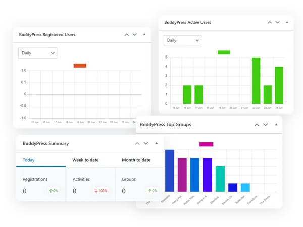
3. Seven graphical widgets. Each renders its own chart and can be dropped into the footer or sidebar. You don’t need all seven running at once, most admins pick two or three that match what they actually check daily.
4. Admin overview widget. Compares registrations, activities, and group creation across periods: last day vs. current day, last week vs. current week, last month vs. current month. This is the single most useful widget for spotting a trend early, since a raw daily count means nothing without something to compare it to.
5. Member activity summary. A separate widget totals up activity across all members, filterable by last seven days, current month, last month, or current year.
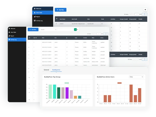
6. Group-specific statistics. A widget dedicated to a single group’s activity, filtered the same way, last seven days, last month, current month, current year. Useful if you run a community with dozens of groups and want to know which ones are actually alive versus which have gone quiet.
7. Top users, groups, and activities. Filter and display the most active members, the most popular groups, and the newest activity for any given period. This is the fastest way to identify who’s carrying your community’s engagement, and who might deserve a moderator role or a shoutout.
8. Registration and active-user trend data. Daily, weekly, monthly, and yearly breakdowns of both new registrations and active users, so you can separate “people are signing up” from “people who signed up are actually sticking around”, two very different metrics that get conflated constantly.

Setting it up and choosing your widgets
Install and activate the plugin like any other WordPress plugin, then head to Appearance > Widgets to place the ones you want. Don’t add all seven to a single sidebar, that’s a common first mistake, and it turns the admin dashboard into a wall of charts nobody actually reads. Pick based on what decision you’re trying to support.
Running membership growth campaigns? The registration trend widget and the admin overview widget are your two. Running a large multi-group community and worried about dead groups? The group-specific widget and the top-groups widget matter more than anything else on the list. Trying to identify potential moderators? The top-users widget does that job directly, the people showing up there week after week are your best moderator candidates, often before you’d have noticed them any other way.
Reading the numbers correctly
A raw activity count by itself tells you almost nothing. Fifty new activities in a week could mean the community is thriving, or it could mean five people posted ten times each while everyone else went silent. That’s why the admin overview widget’s period comparisons matter more than any single total, the question worth asking isn’t “how many activities happened” but “is this week higher or lower than the equivalent week before, and why.”
The same logic applies to registrations. A spike in sign-ups after a marketing push looks good on the surface, but check the active-user trend a few weeks later. If registrations spiked and active users didn’t follow, you attracted people who never engaged, a sign your onboarding flow, not your marketing, needs the attention.
Using the data for retention, not just reporting
Most admins install a stats plugin to have something to show a boss or a client. That’s a fine reason, but it undersells what the data is actually good for. The member activity summary and top-users widgets, checked weekly, let you catch a drop in engagement while it’s still small enough to address, a re-engagement email to lapsed members, a spotlight post featuring an active contributor, a targeted push in a group that’s gone quiet. Waiting until quarterly reporting to notice a decline means you’re reacting to a problem that’s already three months old.
A practical weekly routine
Check the admin overview widget first, it takes ten seconds and tells you whether this week is trending up or down against last week. If something looks off, drill into the member activity summary to see whether the drop is broad or concentrated in a few groups. If it’s concentrated, check the group-specific widget for the groups in question. That three-step routine catches most engagement problems before they become visible in your overall membership numbers, and it takes less time than reading this paragraph.
Common mistakes to avoid
Checking stats obsessively, daily, and reacting to single-day noise is the most common one. Community activity is naturally lumpy, a holiday weekend, a popular thread, a slow Tuesday, and treating every daily fluctuation as a signal leads to chasing ghosts. Look at week-over-week and month-over-month trends instead of day-to-day swings.
The second mistake is never checking group-level data on a multi-group site. Overall site activity can look healthy while three-quarters of your groups sit dormant, propped up by two or three unusually active ones. If group health matters to your community’s structure, check it specifically rather than assuming site-wide numbers tell the whole story.
A third, quieter mistake: treating the stats dashboard as something only admins need to see. Sharing a simplified version of the growth numbers with your most engaged members, in a monthly community update post, for instance, builds a sense of shared ownership. People who feel like they’re watching the community grow together tend to invest more in keeping it growing.
Three ways different communities actually use the data
A coaching or membership community with paid tiers. Here the question that matters is whether paying members are getting enough value to renew. The user profile statistics tab becomes a private diagnostic tool, a member with almost no activity three months into a paid membership is a churn risk long before the renewal date arrives. Some admins build a simple habit around this: once a month, sort by lowest activity among paid members and send a short, personal check-in to the five or ten quietest ones. It’s a manual process, but the plugin is what makes “quietest members” identifiable in the first place instead of a guess.
A large multi-group hobbyist or professional network. With dozens or hundreds of groups, overall site activity is close to meaningless as a health metric, it’s an average that hides enormous variance. The group-specific statistics widget, checked group by group on a rotating basis, is what actually matters here. A group that was active for its first month and has gone silent for the last three needs either a nudge from an admin, a merge with a related group, or an honest decision to archive it. Left alone, a graveyard of dead groups makes the whole community look less active than it is, because new visitors browsing the group directory judge the community by what they see, not by the groups that are quietly thriving elsewhere.
A support-driven or customer community tied to a product. Registrations here often spike around product launches or support campaigns, and the real question is whether that traffic converts into people who actually use the community feature, post questions, answer other members, come back a second time. The registration-versus-active-user comparison is the single most useful pairing of widgets for this use case. A launch that drives five hundred sign-ups and thirty active users four weeks later tells you the community isn’t the bottleneck to fix, the onboarding flow that gets someone from “registered” to “posted something” is.
Turning the top-users widget into a moderator pipeline
Most communities recruit moderators reactively, someone volunteers, or an admin thinks of a familiar name when a moderation gap opens up. That approach misses people who are quietly doing the work already: answering questions in the activity feed, welcoming new members, keeping a group’s tone civil, without ever raising their hand for a formal role.
The top-users widget, filtered to a monthly view and checked consistently over a quarter, surfaces exactly these people. Someone who shows up in the top ten for three consecutive months, purely from organic activity, is demonstrating the behavior you’d want from a moderator before you’ve even asked them. Reach out to that person directly rather than posting a general “moderators wanted” call, a specific, “we’ve noticed how active and helpful you’ve been, would you be interested in a moderator role” message converts at a far higher rate than an open call ever does, because it’s addressed to someone the data already told you was engaged.
What the data won’t tell you
Activity counts measure volume, not sentiment. A group with a lot of posts can be a lot of arguing rather than a lot of collaborating, and the plugin has no way to distinguish the two, a spike in group activity is worth a manual read-through before you assume it’s good news. Similarly, a quiet group isn’t automatically a failing one; some professional or niche communities are healthy with low posting volume because members check in for reference material rather than conversation. Read the numbers as a starting point for investigation, not a verdict on their own.
Frequently asked questions
Does this plugin track individual page views, like Google Analytics does? No. It’s built around BuddyPress activity, registrations, posts, group actions, not general web traffic. Pair it with a standard analytics tool if you need both pictures.
Can members see their own stats, or is this admin-only? Members get a personal statistics tab on their own profile showing their own activity breakdown. The site-wide widgets and admin overview are typically admin-facing.
Will adding seven widgets to my dashboard slow down page load? Each widget runs its own query against the activity log. On a large, busy site, running all seven simultaneously in a public-facing sidebar can add measurable overhead, that’s another reason to be selective about which widgets you actually display, rather than turning everything on by default.
How far back does the historical data go? As far back as the plugin has been active and logging. If you install it on a site that’s been running for two years, you won’t get retroactive data for those two years, the log starts from activation forward.
Can I export this data for a report to stakeholders? The widgets are designed for in-dashboard viewing. If you need a formal export for a board meeting or investor update, plan to take screenshots of the relevant charts or manually compile the numbers the widgets display, since the plugin’s focus is visualization rather than reporting exports.
Does the plugin work if my site uses BuddyBoss Platform instead of BuddyPress directly? It’s built against the BuddyPress data structures that BuddyBoss Platform also uses under the hood, so activity, groups, and registrations track the same way. Test it on a staging copy of your site first if you’re running a heavily customized BuddyBoss setup, the same way you would before installing any plugin on a production community.
Will this conflict with a caching plugin? Widget data pulls from the database on render, so aggressive full-page caching can serve a stale stat widget to visitors until the cache clears. If your host runs page caching, exclude the admin dashboard from the cache rules, which most caching plugins already do by default since wp-admin pages aren’t meant to be cached anyway.
What’s the difference between “active users” and “registered users” in the trend data? Registered users is a running total of everyone who’s ever signed up. Active users, in this context, means accounts that generated at least one logged activity in the selected period. A site can have five thousand registered users and two hundred active ones in a given month, that gap is exactly the number worth watching.
Where this fits against general web analytics
Google Analytics and similar tools answer “how much traffic is this site getting.” BuddyPress Stats answers a narrower, more useful question for a community specifically: “how much is my community engaging with itself.” Those are different questions with different answers. A site can have healthy overall traffic while its actual community features, groups, activity posting, member-to-member interaction, quietly decline, and general analytics won’t surface that. This plugin will, because it’s measuring the thing that actually defines a community site rather than a generic content site.
The BuddyPress Stats plugin doesn’t make your community more active. What it does is take the guesswork out of knowing whether it already is, and give you enough lead time to act before a quiet decline becomes an obvious one.
Most admins who install this end up checking two or three widgets, not seven. That’s fine. The value isn’t in the volume of charts available, it’s in picking the two numbers that actually correlate with whether your community is healthy, and looking at them often enough that a downward trend gets caught in week three instead of month three.
Check the admin overview once a week. That single habit is worth more than any individual chart the plugin ships with.